How to Use Figma for UI Design Beginners
How to use Figma for UI design beginners: learn frames, components, auto layout, and prototyping with this easy, step-by-step guide.
If you’ve just opened Figma for the first time and felt a little lost staring at that blank canvas, you’re not alone. Almost every designer remembers that moment. The good news is that Figma for UI design beginners is actually one of the friendliest ways to start learning interface design, even if you’ve never touched a design tool before.
Figma has become the default choice for product teams, freelancers, and students because it runs entirely in the browser, updates in real time, and doesn’t demand a steep technical learning curve. You don’t need to install anything, you don’t need a powerful computer, and you don’t need a design degree to start moving pixels around and making something that looks like a real app or website.
This guide walks you through everything a beginner actually needs: setting up your workspace, understanding frames and layers, using components and auto layout, building a simple prototype, and picking up a few habits that will save you hours of frustration later. We’ll skip the jargon-heavy explanations and focus on what you’ll actually do with your mouse and keyboard. By the end, you’ll have designed your first screen and understood the core workflow that professional UI designers use every day. Let’s get into it.
What Is Figma and Why Beginners Choose It
Figma is a cloud-based interface design tool. That means your files live online instead of on your hard drive, and anyone with the link can view or edit them, similar to how Google Docs works for writing. This is a big part of why Figma UI design has taken over from older desktop-only tools like Sketch or the original Adobe XD.
A few reasons beginners tend to gravitate toward it:
- No installation headaches. You open a browser tab, log in, and you’re designing.
- Free plan that’s genuinely usable. You can build full projects, use components, and prototype without paying anything.
- Real-time collaboration. Multiple people can work in the same file at once, which mirrors how actual design teams operate.
- A huge community library. Thousands of free templates, icon sets, and UI kits are available inside the app itself.
- Cross-platform. Windows, Mac, Linux, Chromebook, it doesn’t matter. If you have a browser, you have Figma.
For anyone learning UI design from scratch, this combination of low barrier to entry and professional-grade features is hard to beat. You’re learning on the same tool that teams at companies like Duolingo, Slack, and Airbnb use daily, so the skills transfer directly to real jobs.
Step 1: Set Up Your Figma Account and Workspace
Before you design anything, you need a home base.
- Go to Figma’s website and sign up with an email or a Google account.
- Once you’re logged in, you’ll land on your dashboard. This is where all your files and projects live.
- Click “New design file” to open a blank canvas.
- Take a minute to rename the file at the top left so you’re not stuck with “Untitled.”
Your Figma dashboard is also where drafts, team projects, and community files show up, so it’s worth exploring before you dive into your first design. If you’re working with a class, a bootcamp, or a small team, you can also create a “Team” workspace, which keeps shared files separate from your personal drafts.
Understanding the Figma Interface
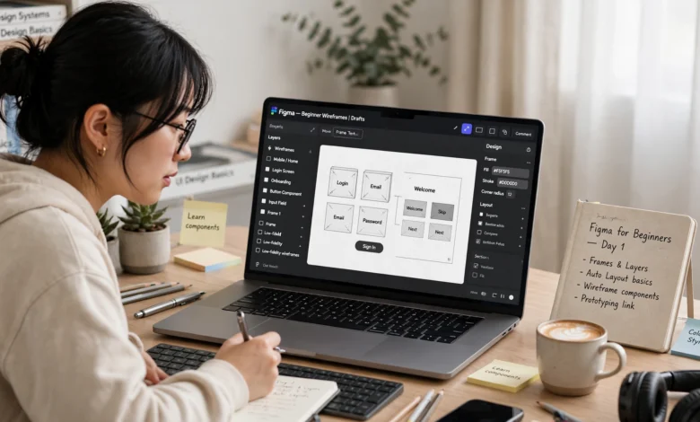
When your file opens, you’ll see four main areas, and getting comfortable with them is the real first step in learning how to use Figma:


- Top toolbar: This holds your selection tool, frame tool, shape tools, text tool, and the play button for previewing prototypes.
- Left panel: This is your layers and pages panel. Every shape, text box, and group you create shows up here, nested like folders.
- Canvas (the middle): An infinite space where you actually place and arrange your design elements.
- Right panel: This changes depending on what’s selected. It controls alignment, sizing, color, typography, effects, and layout settings.
Spend ten minutes just clicking around before you build anything. Select a random shape, watch how the right panel changes, undo a few things. This kind of low-stakes exploring genuinely speeds up how fast you get comfortable.
Step 2: Learn Frames, the Building Blocks of Every Design
In Figma, you don’t design directly on an empty canvas. You design inside frames, which act like the screen boundaries of an app or website.
To create one:
- Press F or click the Frame tool in the toolbar.
- On the right panel, pick a preset size. For mobile UI design, something like “iPhone 14” is a common starting point. For web design, a 1440px or 1920px desktop frame works well.
- Click and drag on the canvas, or just click a preset, and your frame appears.
Frames matter because they define the exact dimensions your design will be viewed at, which is critical when you eventually hand off your design to a developer or export assets. Think of a frame as your artboard, your canvas within the canvas.
A few practical tips for working with frames:
- Name your frames clearly (Login Screen, Home Page, Checkout) instead of leaving them as “Frame 1.” This matters a lot once your file has 20+ screens.
- You can nest frames inside frames, which is useful for cards, sections, or repeated components.
- Use the “Resizing” settings under the frame’s properties if you want elements inside to scale or stay fixed when the frame changes size.
Step 3: Get Comfortable with Layers, Shapes, and Text
Once you have a frame, it’s time to add content. This is where most UI design beginners start building real muscle memory.
Basic Shape and Text Tools
- Rectangle (R): Great for buttons, cards, backgrounds, and image placeholders.
- Ellipse (O): Useful for avatars, icons, and circular buttons.
- Text (T): Click anywhere on the canvas and start typing. You can adjust font, size, weight, and spacing from the right panel.
- Pen tool (P): For custom vector shapes and icons, though beginners can usually get by without touching this for a while.
Every shape or text box you place gets added to the Layers panel on the left. Layers stack the same way they do in Photoshop, meaning whatever is higher in the list sits visually on top of whatever is below it.
Grouping and Organizing Layers
As your design grows, your layers panel can turn into a mess fast if you don’t organize it. A few habits worth building early:
- Select multiple layers and press Cmd/Ctrl + G to group them.
- Rename groups so they describe what they contain, like “Header” or “Card Component.”
- Use Cmd/Ctrl + Alt + G to wrap a selection in a frame instead of a plain group, which gives you more layout control.
Good layer organization isn’t just about tidiness. It directly affects how easily you (or a teammate) can find and edit elements later, and it becomes essential once you start using auto layout and components.
Step 4: Understand Auto Layout for Responsive Design
Auto layout is one of Figma’s most powerful features, and it’s genuinely worth learning early even as a beginner, because it saves an enormous amount of manual resizing work.
In plain terms, auto layout lets a group of elements automatically adjust their spacing, padding, and alignment when content changes, similar to how flexbox works in CSS. If you add a longer piece of text to a button, auto layout can automatically resize the button instead of you dragging edges by hand.
To apply it:
- Select the layers you want to combine, like an icon and a text label inside a button.
- Press Shift + A, or click the auto layout icon in the right panel.
- Adjust the spacing, padding, and alignment options that appear.
Once auto layout is applied, you can set elements to “Hug contents,” “Fill container,” or “Fixed size,” which determines how they behave when the frame or content around them changes. This single feature is often what separates a design that behaves like a real interface from one that just looks like a static picture.
Step 5: Use Components to Build Reusable UI Elements
If you’re designing more than one screen, and most UI design projects involve many, you’ll quickly notice you’re reusing the same buttons, input fields, and navigation bars over and over. This is exactly what components are for.
A component is a master version of an element that you can reuse across your file. When you update the master component, every copy (called an “instance”) updates automatically.
How to Create a Component
- Design the element once, a button, a card, whatever you need.
- Select it and press Cmd/Ctrl + Alt + K, or click the component icon in the toolbar.
- The element now has a purple outline, marking it as a main component.
- Drag copies of it onto your canvas wherever you need it. These copies are instances.
Why Components Matter for Beginners
- They keep your design consistent across dozens of screens without extra manual work.
- They mimic how real design systems function at companies, so learning them early builds a genuinely transferable skill.
- Variants let you group related components (like a button in its default, hover, and disabled states) into a single, switchable component.
Getting comfortable with components early will save you from the common beginner trap of redesigning the same button five different ways across one project.
Step 6: Add Interactivity with Prototyping
Once your screens are built, Figma lets you connect them into a clickable prototype, which is where your static design starts to feel like a real product.
- Switch to the Prototype tab in the right panel.
- Select an element, like a button, and drag the small arrow that appears on its edge to another frame.
- Choose the interaction type (On Click, On Drag, While Hovering, etc.) and the animation (Instant, Dissolve, Smart Animate, and so on).
- Click the Play button at the top right to preview your prototype and click through it like a real app.
Prototyping is where beginners often have their “aha” moment, because you go from looking at flat screens to actually experiencing the flow a real user would go through. Even a simple three-screen prototype, like Login to Home to Profile, teaches you a lot about spacing, timing, and how interactions actually feel in motion.
Step 7: Explore Plugins and the Figma Community
Once the basics feel natural, the Figma Community and plugin ecosystem are where you’ll speed up your workflow dramatically.
- Community files: Thousands of free UI kits, icon packs, wireframe templates, and full app designs are available to duplicate and study. Reverse-engineering how experienced designers structure their files is one of the fastest ways to level up.
- Plugins: Tools that extend Figma’s functionality, things like content generators for realistic placeholder text and images, accessibility checkers, and automatic renaming tools for messy layers.
- Design systems: Many companies publish their own design system libraries on the Community page, which is a great way to see how professional teams organize components, colors, and typography at scale.
Browsing community files isn’t cheating. Studying how well-organized professional files are built is one of the best ways to shortcut months of trial and error.
Common Mistakes Beginners Make in Figma
A few patterns show up again and again with people new to the tool:
- Not using frames properly. Designing loosely on the canvas without frames makes it hard to organize or export your work later.
- Ignoring auto layout. Manually resizing and repositioning every element wastes time that auto layout handles automatically.
- Skipping components. Redesigning the same button or card repeatedly instead of building it once and reusing it.
- Messy layer names. “Rectangle 47” tells you nothing six weeks later. Naming things as you go pays off constantly.
- Designing without a grid or spacing system. Random spacing between elements makes a design feel unpolished, even if the individual pieces look fine.
Avoiding these habits early makes a noticeable difference in how professional your files look and how easily you can edit them later.
Basic UI Design Principles to Keep in Mind
Learning the software is only half the picture. UI design also depends on a handful of principles that apply no matter what tool you’re using:
- Hierarchy: Guide the eye by making the most important elements the most visually prominent, through size, weight, or color.
- Consistency: Reuse the same spacing, colors, and button styles throughout a project so the interface feels cohesive.
- Contrast: Text and interactive elements need enough contrast against their background to remain readable and accessible.
- Whitespace: Don’t be afraid of empty space. It reduces clutter and makes interfaces easier to scan.
- Alignment: Elements that line up neatly, even subtly, make a design feel intentional rather than accidental.
If you want to go deeper on these fundamentals, the Nielsen Norman Group publishes some of the most respected, research-backed articles on usability and interface design, and it’s worth bookmarking as you keep learning.
Practicing Your First Project: A Simple Login Screen
A great way to apply everything above is to build one simple, real screen rather than jumping between tutorials. Here’s a beginner-friendly project outline:
- Create a mobile frame (F key, pick a phone preset).
- Add a rectangle background and a bold heading like “Welcome Back.”
- Build two input fields for email and password using rectangles, text, and auto layout so they resize cleanly.
- Design a primary button, then turn it into a component so you can reuse it elsewhere.
- Add a secondary text link for “Forgot password?” underneath.
- Prototype the button so it links to a second frame, like a Home screen.
- Preview it with the Play button and click through the flow.
This single exercise touches frames, shapes, text, auto layout, components, and prototyping, which covers the entire beginner workflow in one project. Repeating small projects like this, a signup screen, a settings page, a checkout flow, is far more effective for learning than passively watching tutorials without building anything yourself.
Helpful Resources to Keep Learning
Once you’ve got the basics down, a few resources are worth exploring:
- Figma’s own Help Center has detailed, official documentation on every feature mentioned in this guide, and it’s updated as the tool evolves.
- The Figma Community page inside the app, where you can duplicate real projects and study how they’re structured.
- YouTube channels dedicated to UI/UX design, which are especially useful for watching someone’s cursor move in real time.
Learning Figma for UI design is less about memorizing every menu and more about building things repeatedly until the workflow becomes second nature. Give yourself permission to make ugly first drafts. Every designer’s early work looks rough, and that’s part of the process.
Conclusion
Learning Figma for UI design beginners doesn’t require a design background or expensive software, just a willingness to open the tool and start building. Once you understand frames, layers, components, auto layout, and basic prototyping, you already have the core workflow that professional UI designers rely on every day, and everything else you learn from here builds naturally on that foundation. Start small, recreate designs you admire, build a few practice screens, and revisit the fundamentals of hierarchy, consistency, and spacing as you go.
The more you design inside Figma, the more the interface stops feeling technical and starts feeling like a natural extension of how you think through a screen. Give yourself a real project, even something as simple as a login screen, and you’ll learn more in an afternoon of hands-on practice than in hours of passively watching tutorials.